BASIC GUIDE
Which chart type to use for your business question
A dashboard isn't about filling the screen with charts. It's about answering questions with the right visualization. Choosing the wrong chart type confuses more than it helps: a pie chart with fifteen categories or a KPI without a time comparison doesn't lead to any decision.
The rule is simple: first define what you want to know, then choose how to show it.
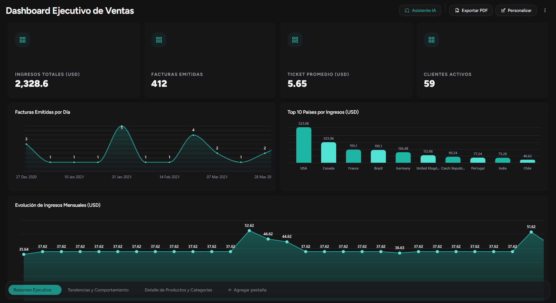
Quick guide: question → chart
| If you want to know… | Use… |
|---|---|
| How much did we sell this month? | KPI, a big number with trend |
| How did sales evolve over time? | Line or area chart, time trend |
| Who or what sold the most? | Bar chart, comparison across categories |
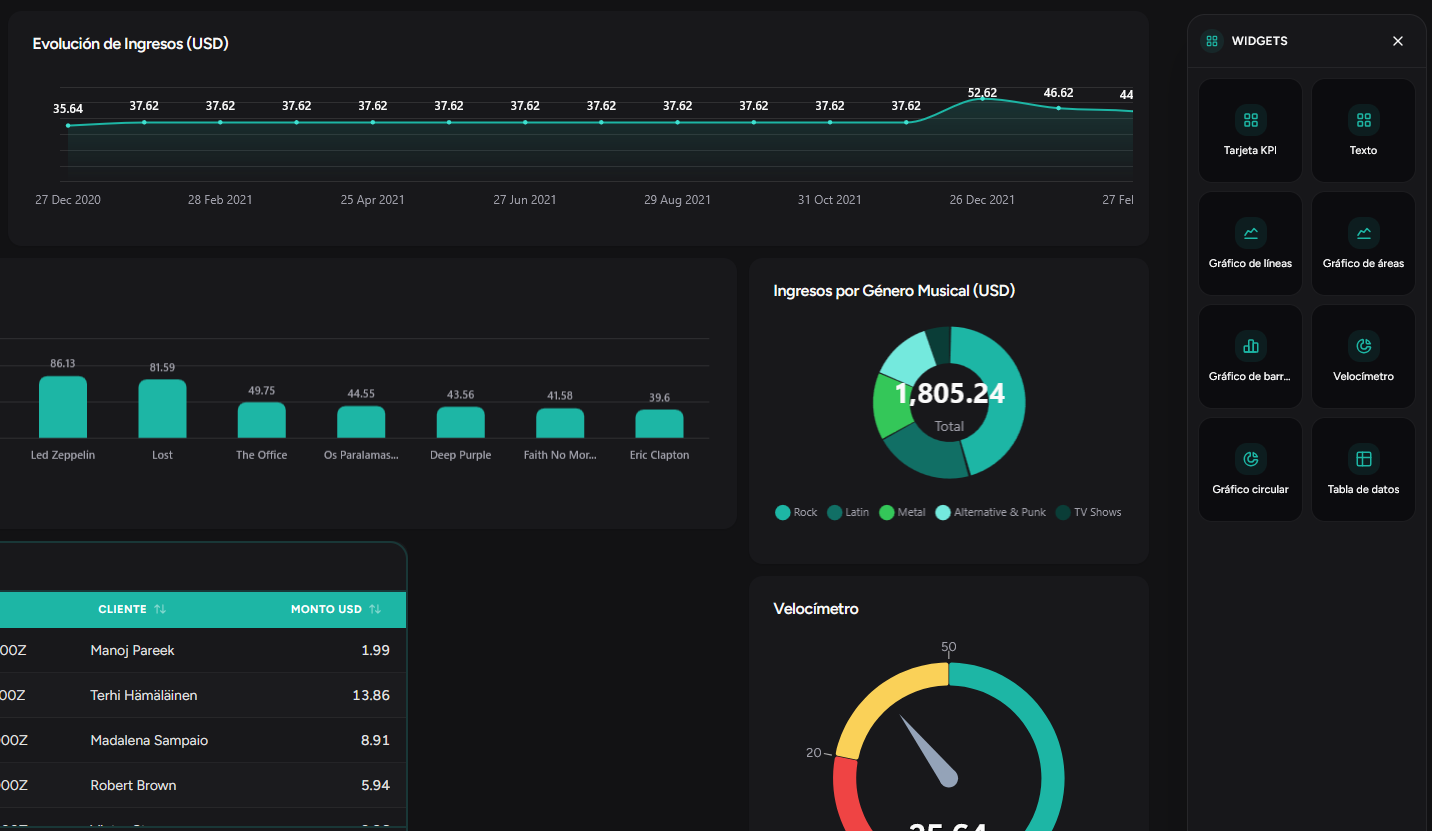
| What proportion does each channel represent? | Pie or donut, only with few categories (max. 5–6) |
| How far along are we vs the goal? | Gauge, progress toward a target |
| Do I need to see row-by-row detail? | Table, listings with multiple columns |
Common mistakes
Using a pie chart when there are many categories → better horizontal bars
Putting a KPI without context → always include comparison (previous month, goal, same period last year)
Line chart to compare disparate categories → better bars
Table when you only need a total → better KPI
Examples by area
Sales
Monthly revenue KPI + evolution line + bars by salesperson + table of open opportunities
Operations
On-time delivery KPI + cycle time line + bars by region + table of delayed orders
Finance
Margin KPI + cash flow line + expense pie by category + accounts receivable table
Ready to see your metrics in a dashboard?
Join early access and connect your data in minutes—no SQL or manual reports.