Which chart type should you use?
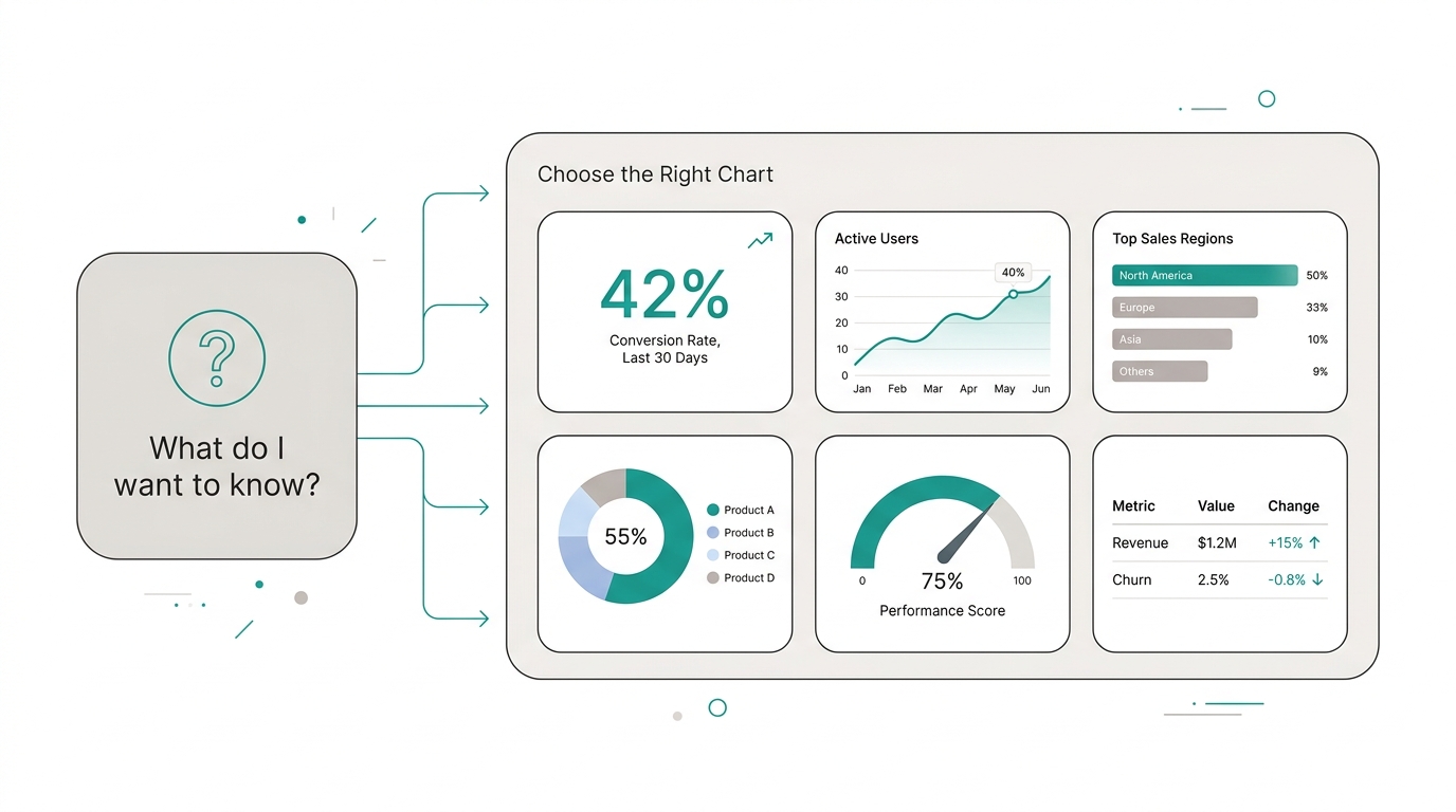
Your dashboard has 20 widgets, but every morning you lose five minutes trying to understand what the data is saying. The problem isn't the amount of data: it's that the wrong chart is hiding the answer.
A pie chart with 12 categories tells nobody anything. A KPI without a trend arrow is just a number floating in space. Choosing the wrong chart type isn't a design mistake: it's a poorly informed business decision.
The rule is simple: first define what you want to know, then choose how to show it. In three seconds or less.
The visual guide: from question to chart
Every business question has a chart that answers it best. It’s not a matter of taste. Before adding a widget, ask yourself: “What action am I going to take when I see this?”
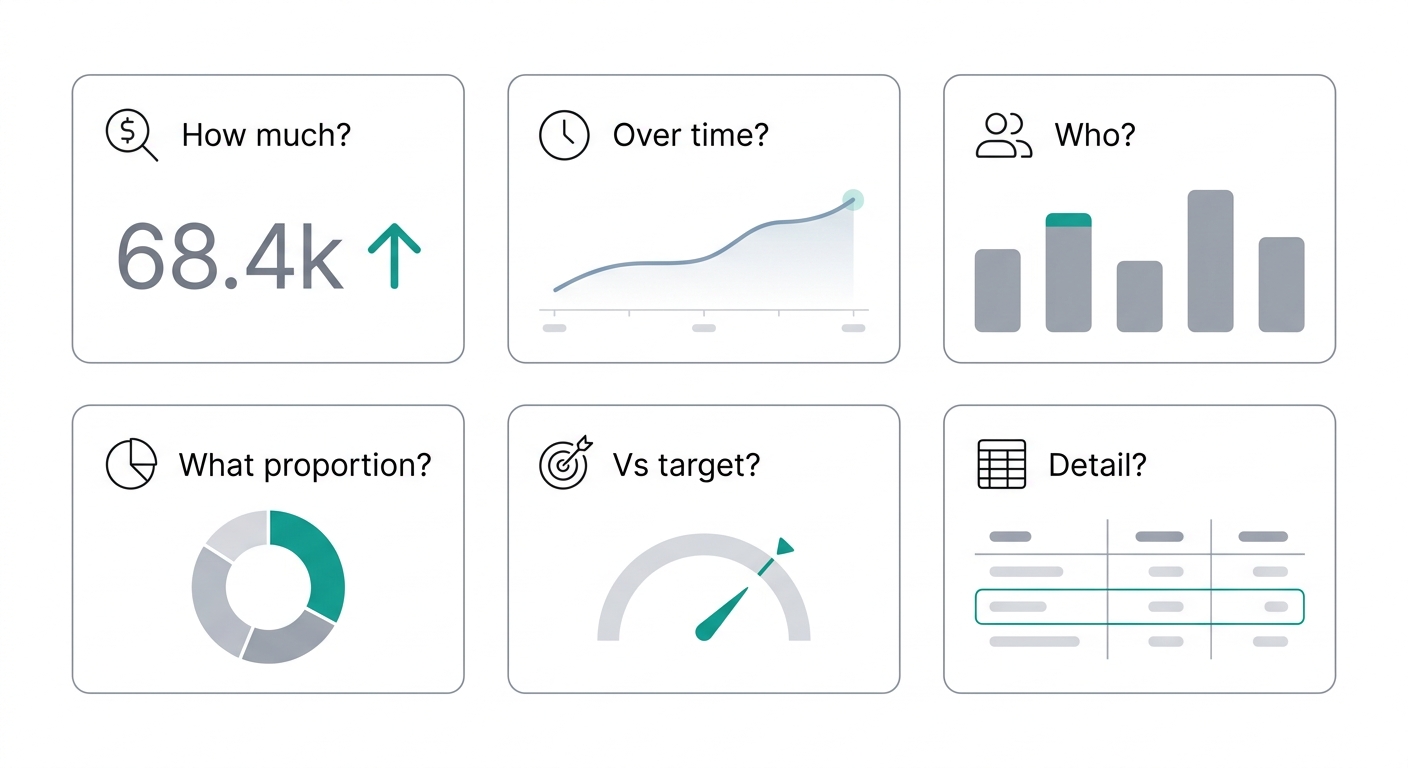
- How much did we sell? → A big KPI with trend. One number answers.
- How did it evolve over time? → Line or area chart. Shows continuous change week by week.
- Who sold the most? → Bars. Compares categories side by side, ordered highest to lowest.
- What proportion does each represent? → Pie or donut. Max 5 categories with clear differences.
- How far are we vs the goal? → Gauge. Visual progress toward a target.
- Do I need the detail? → Table. When you need row-by-row detail with multiple columns.
Monday at 9 a.m. you check your dashboard. Do you know in three seconds whether you’re winning or losing? If not, change the chart, not the data.
Same data, two different stories
You have this month’s sales by channel: web ($52,000), in-store ($38,000), distributors ($15,000), and marketplace ($42,000).
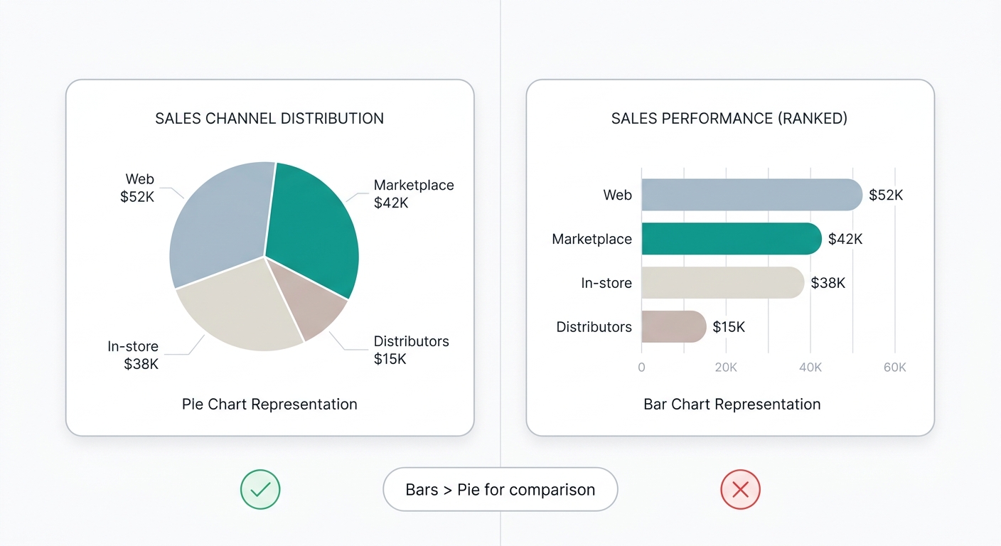
- Pie chart: your eye has to compare angles. Was web higher than marketplace? You have to look twice.
- Horizontal bars: you see instantly that web leads with $52,000, marketplace follows, and distributors are last.
Practical rule: if you have more than 4 categories or similar values, use bars. Pies only work with 3-4 categories where one clearly dominates over the rest.
Mistakes that cost decisions (and how to avoid them)
Pie chart with too many categories The eye can’t distinguish 10 slices. Convert it to horizontal bars ordered highest to lowest. Your team will understand it in one second instead of ten.
KPI without context “$147,000” tells you nothing. Did it go up or down vs. last month? If you don’t include a comparison (previous month, target, or same period last year), you’re showing a number, not a KPI.
Line chart for comparing separate things Lines suggest continuity. If you’re comparing sales by region, use bars. If you’re showing evolution over time, use a line.
Table when you only need a total If the answer is one number, don’t make anyone scan a table. Use a big KPI and move on.
Examples by area to apply on Monday
Sales: Monthly revenue KPI + weekly trend line + bars by rep + open opportunities table Operations: On-time delivery KPI + cycle time line + bars by region + delayed orders table Finance: Margin KPI + cash flow line + expense breakdown donut (max 5) + accounts receivable table
What to do Monday: open your dashboard. For each widget, ask yourself “what decision does this let me make?” If the answer is “nothing in particular,” change the widget or remove it.
The golden rule
Don’t ask “Which chart looks best?” Ask “What question do I need to answer?”
The right chart isn’t the prettiest one. It’s the one that makes whoever is looking understand the data and know what to do in three seconds or less.
Get started today with
RapidBoard for your team
Early access is open. Join the first 100 spots and start making data-driven decisions faster.