Excel dashboard examples to inspire your next build
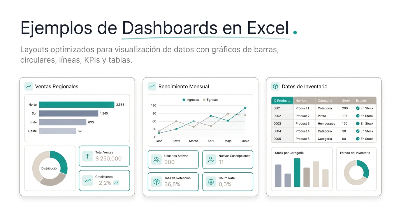
Sometimes the hardest part of creating a dashboard isn't the tool: it's knowing where to start. What KPIs to include, how to organize them, which charts to choose. Facing a blank Excel sheet, even experienced managers wonder: 'what should this look like?'
This guide has 4 concrete Excel dashboard examples by area. Each includes the KPIs to include, the panel structure, and the recommended chart type. Use them as starting points: copy the structure and adapt it to your business.
Sales Dashboard in Excel
KPIs: Revenue vs Target (KPI card with variance), Pipeline by stage (horizontal bar chart), Sales by rep (bar chart with ranking), Average deal size (KPI card with 3-month trend).
Structure: Top row: 3 KPI cards. Middle left: Revenue trend line chart (12 months). Middle right: Pipeline by stage (horizontal bars). Bottom: Rep performance table with progress bars.
Recommended slicers: Month, Region, Product line.
Marketing Dashboard in Excel
KPIs: CAC (KPI card with 6-month trend), Leads generated (bar chart by channel: organic, paid, email, social, referrals), MQL to SQL conversion (funnel visual), Campaign ROI (table).
Structure: Top row: 3 KPI cards. Middle: Leads by channel (stacked bars, 6 months) + Funnel MQL→SQL→Opportunity→Customer. Bottom: Active campaigns table with budget, leads, and calculated ROI.
Recommended slicers: Channel, Month, Campaign.
Financial Dashboard in Excel
KPIs: Cash Flow (waterfall chart), MRR (line chart with month-over-month growth), Gross Margin (KPI card with previous month comparison), Burn Rate (KPI card with runway projection).
Structure: Top row: 3 KPI cards. Middle: Cash flow waterfall (revenue green, expenses red, net blue). Bottom left: MRR 12-month trend (line). Bottom right: Expense table by category vs budget.
Recommended slicers: Quarter, Expense category.
HR Dashboard in Excel
KPIs: Headcount vs Plan (bar chart by area), Turnover (KPI card with 12-month trend), Time to hire (table by open position), eNPS (bar chart by area).
Structure: Top row: 3 KPI cards. Middle: Headcount by area (bars) + 12-month turnover (line). Bottom: Open positions table with days in process and candidates per stage.
Recommended slicers: Area, Seniority, Location.
From Excel dashboard to live dashboard
These 4 examples work well in Excel for small teams. But when your team grows, the same problems appear: data becomes outdated between export and paste, only one person can edit without risking broken formulas, sharing means emailing a file.
The good news: the structure you learned building Excel dashboards transfers directly to BI tools. KPI cards, trend charts, detail tables, and slicers are universal concepts. The only difference: instead of copying and pasting data every Monday, the tool connects directly to your sources and updates automatically.
Get started today with
RapidBoard for your team
Early access is open. Join the first 100 spots and start making data-driven decisions faster.