Excel Dashboard: how to build a professional one
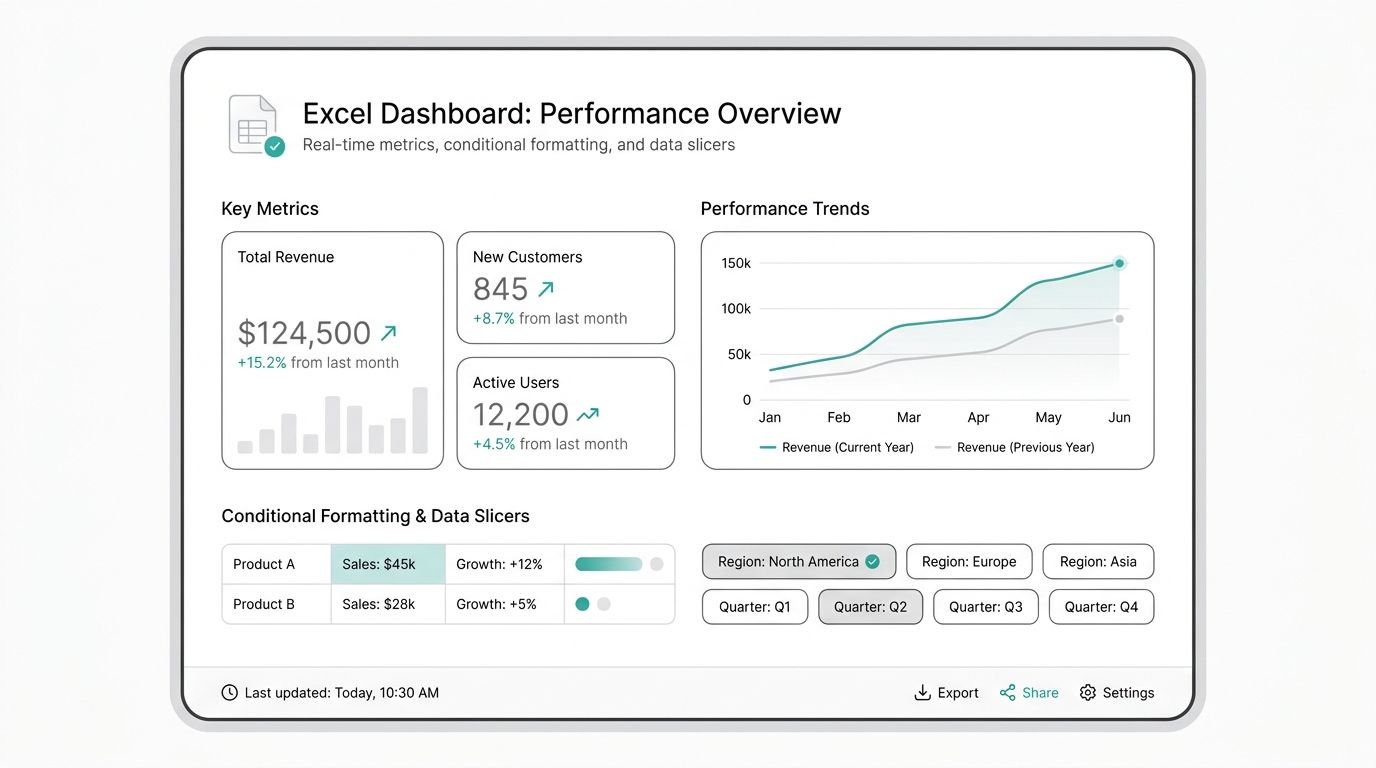
Excel is, without exaggeration, the most used data analysis tool in the world. Five out of six companies use it for reporting. Not because it's the best option, but because it's already installed on your computer when you arrive at the office.
The problem isn't starting with Excel. The problem is staying trapped in Excel when the business has grown. An Excel dashboard that takes 4 hours to update every Monday isn't a dashboard: it's a manual report with a pretty face.
In this guide I'll show you how to build a professional Excel dashboard — with dynamic charts, summary tables, and clean design — and, more importantly, how to make the leap to a live dashboard that updates itself, without macros, VBA, or depending on the 'Excel person' on the team.
Why Excel dominates the dashboard world
Excel didn’t win by being the best visualization tool. It won by being everywhere. Every office worker opens a .xlsx file with a double click. No installation, no onboarding, no IT permission needed.
But that accessibility hides three problems every team discovers as they scale:
- Static data. Your Excel dashboard shows what you manually pasted. If the source changes, your panel lies.
- Single owner. Carlos updates the dashboard. If Carlos is on vacation, there’s no report.
- No real collaboration. Excel is shared via email. You end up with 7 versions of the same file and no one knows which is definitive.
Excel is an excellent first step. Mistaking it for a reporting system is like using a screwdriver to hammer a nail: it works, but it’s not the right tool.
The 3 phases of an Excel dashboard
Phase 1: The glorified spreadsheet
Everything starts with a simple table. You manually paste data. Quick to build but unsustainable when you go from 5 to 50 indicators.
Phase 2: Pivot tables and connected charts
The quality leap comes with pivot tables. You connect a source, create data slicers, and generate charts that update on refresh. Most teams get stuck here because pivot tables require clean data structure, charts break if someone changes the data range, and manual refresh becomes a weekly ritual.
Phase 3: Macros, VBA, and the complexity trap
When the dashboard grows, the temptation to automate with macros appears. The problem: macros only work on the computer that created them, break with every Excel update, and no one else on the team can maintain them.
How to build an Excel dashboard: step by step
Step 1: Define questions, not charts
Before opening Excel, answer: what decisions will this dashboard drive? Three questions = maximum 6 KPIs. Less is more.
Step 2: Prepare data in a structured table
80% of Excel work is cleaning data. Basic rules: one row = one record, one column = one field, no merged cells in the middle, use Table format (Ctrl+T).
Step 3: Pivot table for each KPI
Every dashboard KPI should come from a pivot table, not manual formulas. They allow filtering, grouping, and segmenting without touching raw data.
Step 4: Design the panel on a clean sheet
Create a separate sheet just for the dashboard. Top row: 3-4 KPI cards. Middle row: trend chart. Bottom row: detail table by category. Design rule: everything must fit on one screen.
Step 5: Protect and share (but not via email)
Protect cells so no one breaks the formulas. Share via OneDrive or SharePoint. But remember: if your dashboard is shared as an email attachment, it’s outdated before the recipient opens it.
Excel dashboard vs live dashboard comparison
| Feature | Excel Dashboard | Live Dashboard (RapidBoard) |
|---|---|---|
| Updates | Manual (copy/paste) | Automatic from source |
| Collaboration | One owner, file via email | Multiple users, always online |
| Historical data | Limited by file size | Unlimited, connected to your DB |
| Learning curve | High (formulas, macros, VBA) | Low (ask in plain English) |
| Share with clients | Send PDF via email | Link with access control |
| Mobile updates | Not available | Responsive dashboard |
| Built-in AI | Not available | KapIA answers questions |
When is it time to leave Excel?
If you answer yes to two or more:
- Does your dashboard take over 1 hour to update?
- Do more than one person need to see updated data simultaneously?
- Does your data live in databases, CRMs, or Google Sheets, not just Excel?
- Has anyone made a decision with last week’s data because the dashboard wasn’t updated?
- Is the “Excel person” on your team a bottleneck?
How to migrate from Excel to a live dashboard
Migration doesn’t require starting from scratch:
- Identify your real data sources (if you paste from Google Sheets, your source is Google Sheets — connect it directly)
- Replicate the KPIs you already use
- Add the KPIs you always wanted but couldn’t calculate
- Share a link, not a file
Get started today with
RapidBoard for your team
Early access is open. Join the first 100 spots and start making data-driven decisions faster.