Data analysis in Excel: a beginner's guide
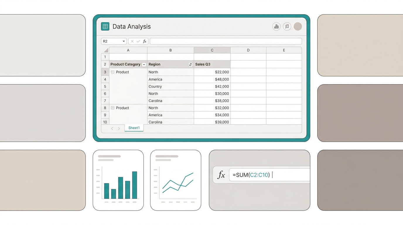
Before Power BI, before Tableau, before any modern BI tool, there was Excel. And it's still here. It's the most democratic data analysis tool that exists: no installation, no budget, no IT permission needed. Just open a file and start.
This guide isn't an exhaustive Excel tutorial. It's a map: the 4 features you need for useful data analysis without being an expert, the order to learn them, and — crucially — when your analysis outgrows what Excel can offer.
The 4 Excel features every analyst should master
1. Structured Tables (Ctrl+T)
80% of Excel problems come from not using structured tables. Benefits: ranges auto-expand when adding rows, formulas auto-copy downward, references use column names instead of coordinates (=[@Sales] instead of =B2), linked pivot tables update automatically.
If you learn only one thing from this guide, make it Ctrl+T.
2. Pivot Tables
The most powerful Excel feature for data analysis. Summarize, group, and cross-reference data without writing a single formula. Group sales by month, product, and region with 3 clicks. Change view by dragging fields. Filter with slicers — interactive buttons that change the entire table.
3. Pivot Charts
Once you have the pivot table, the chart is one more click. The 4 charts covering 90% of cases: Column/Bar (compare categories), Line (show trends over time), Pie/Donut (show proportions), KPI Card (single big number vs target).
4. Slicers
Buttons that filter all tables and charts in the dashboard simultaneously. Turn a static report into an interactive dashboard. Create: select pivot table → Insert → Slicer → choose field.
Excel’s 3 limitations for data analysis
- Scale — Excel crawls with 100K+ rows. If your business generates thousands of transactions daily, Excel isn’t the tool.
- Manual updates — Copy-paste doesn’t scale. Someone must export, copy, paste, verify. If that person goes on vacation, the dashboard freezes.
- Collaboration — One file, one owner. Shared via email or OneDrive. In practice, formulas break and there are 7 versions circulating.
When does Excel reach its limit?
Three questions. Two “yes” answers = Excel is done:
- Is your data over 50 MB or 100,000+ rows?
- Do more than one person need to see updated analysis simultaneously?
- Do you spend over 2 hours per week manually updating data?
The bridge: from Excel to live dashboards
If you can build pivot tables and charts in Excel, you already know how to build dashboards. With tools like RapidBoard, the only changes are:
- Data connects directly to the source (no export/copy/paste)
- Updates automatically (dashboard refreshes when the source changes)
- Shared via link (same URL, always updated for everyone)
- Ask in plain English (instead of building a pivot table for each question)
The transition requires zero new learning: the concepts you already handle in Excel (tables, charts, filters, segmentation) apply identically. Only now you don’t have to update the data yourself.
Get started today with
RapidBoard for your team
Early access is open. Join the first 100 spots and start making data-driven decisions faster.