Dashboard examples by industry
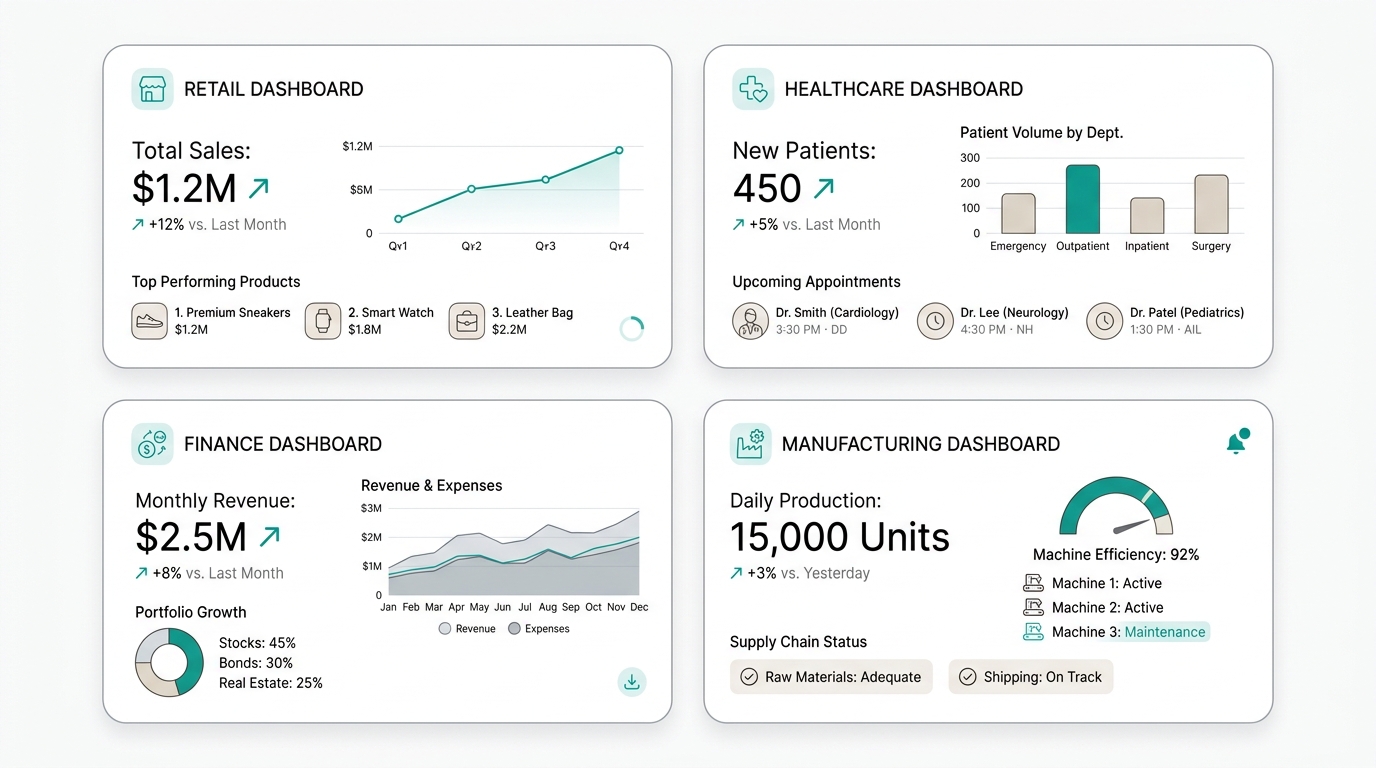
When a team decides to build their first dashboard, the most common question isn't technical — it's 'what metrics should we include?' There's no universal answer because every industry and department measures success differently.
What does exist are recurring patterns. A sales manager anywhere needs to see pipeline and conversion. A CFO needs cash flow and margin. A CMO needs CAC and campaign ROI. The KPIs differ, but the dashboard structure follows similar principles.
In this guide we walk through 7 industry dashboards with the KPIs teams actually use, the structure that works for each case, and the specific mistakes to avoid for each panel type.
Sales dashboard
The sales dashboard is the most common and also the most error-prone. The typical mistake is showing activity metrics (calls made, emails sent) instead of outcome metrics (revenue closed, pipeline generated).
Key KPIs
- Revenue vs target — The big number. Closed sales in the current period against the goal. With percentage variation and trend.
- Pipeline by stage — Total opportunity value at each funnel stage: prospecting, qualification, proposal, negotiation, closing.
- Conversion rate — Percentage of opportunities moving from one stage to the next. The most important bottleneck indicator.
- Average deal size — Average value of closed sales. Useful for detecting whether the team is pursuing large or small clients.
- Average sales cycle — Days from opportunity entry to close. When it rises, something is slowing the process.
Recommended structure
| Section | Content |
|---|---|
| Top KPIs | Revenue vs target, pipeline total, conversion |
| By rep | Individual metrics table with ranking |
| By product/line | Stacked revenue bars by category |
| Forecasting | Projection vs target at 30, 60, 90 days |
| Leads | New leads by channel and source |
Specific mistakes
- Focusing on activity over results: 50 calls made don’t matter if they didn’t translate into revenue. The sales dashboard must answer “how much did we sell?”, not “how much did we work?”
- Ignoring the sales cycle: a huge pipeline can be misleading if opportunities have been stuck for 6 months. Pipeline age matters as much as pipeline size.
- Not segmenting by channel: selling through inbound vs outbound vs partners requires different KPIs. Mixing them hides which channel is actually working.
Marketing dashboard
The marketing dashboard has the opposite problem from sales: there’s too much data. Between Google Analytics, social media, email marketing and CRM, marketers drown in vanity metrics.
Key KPIs
- CAC (Customer Acquisition Cost) — The most important marketing KPI. Total marketing and sales spend divided by new customers acquired. It should decrease or stay flat as you scale.
- ROI by channel — Return on investment broken down by channel: organic, paid, social, email, referrals. Without this, you’re spending blind.
- Qualified traffic — Visitors arriving with purchase intent, not just curiosity. Metrics like bounce rate and pages per session help distinguish noise from real leads.
- MQL to SQL conversion rate — Percentage of marketing leads that sales accepts as qualified. The most honest indicator of whether marketing is attracting the right people.
- Share of voice — Your brand’s presence against competitors in the market. Ideal for measuring long-term brand growth.
Recommended structure
| Section | Content |
|---|---|
| Top KPIs | CAC, ROI by channel, leads generated |
| Acquisition | Traffic by source, cost per lead, conversion |
| Content | Article performance, downloads, time on page |
| Funnel | MQL → SQL → Opportunity → Customer |
| Branding | Share of voice, brand traffic, mentions |
Specific mistakes
- Vanity metric obsession: total visits, followers, impressions. These don’t pay salaries. The marketing dashboard must prioritize metrics correlated with revenue.
- Not closing the loop with sales: if the dashboard ends at lead generated but doesn’t show how many converted to customers, you’re measuring activity, not impact.
- Wrong attribution: crediting everything to last click ignores the role of educational content, social media, and word-of-mouth in the customer journey.
Financial dashboard
The financial dashboard has the least room for error. A poorly defined KPI here can lead to decisions with direct consequences on the company’s cash position.
Key KPIs
- Cash flow — The most important KPI of any business. Cash in vs cash out over a period. No positive cash flow, no company.
- MRR / ARR — Monthly and annual recurring revenue. The sacred SaaS metric. With trend and month-over-month variation.
- Gross margin — Revenue minus cost of goods sold, divided by revenue. Indicates how profitable the business is before operating expenses.
- Churn rate — Percentage of customers who cancel in a period. For SaaS, monthly churn should be below 5%. Every churn point you reduce is direct growth.
- Burn rate — Cash the company spends per month. Critical for startups: determines how many months of runway remain.
Recommended structure
| Section | Content |
|---|---|
| Top KPIs | Cash flow, MRR, gross margin |
| Revenue | By product, segment, region |
| Expenses | Breakdown by category vs budget |
| Profitability | EBITDA, net margin, unit contribution |
| Liquidity | Current ratio, days cash, debt |
Specific mistakes
- Only looking at P&L: the income statement shows accounting profitability but says nothing about liquidity. You can show a paper profit and still go bankrupt from lack of cash.
- Not separating recurring from non-recurring revenue: mixing MRR with project revenue or one-time sales distorts business visibility.
- Wrong frequency: a weekly financial dashboard can create noise — financial metrics don’t usually change that much in a week. The owner should set frequency based on decision type.
HR dashboard
HR used to live in Excel with hiring and absenteeism data. Today, people teams need dashboards that connect business metrics with talent metrics.
Key KPIs
- Headcount vs plan — People hired vs budgeted by department. With growth trend and projection.
- Attrition rate — Percentage of employees leaving over a period. Broken down by area, tenure, and reason.
- Time to hire — Days from opening a position to signing the contract. When it rises, the recruiting process has bottlenecks.
- Cost per hire — Total recruitment spend divided by new hires. Includes platforms, agencies, team hours.
- eNPS — Employee Net Promoter Score. Quick survey measuring team satisfaction and loyalty.
Recommended structure
| Section | Content |
|---|---|
| Top KPIs | Headcount, attrition, time to hire |
| Composition | By department, seniority, location |
| Talent | Hires, promotions, departures |
| Culture | eNPS, surveys by team, absenteeism |
| Development | Completed training, internal promotions |
Specific mistakes
- Only operational metrics: how many people come and go, without connecting to business metrics like productivity or revenue per employee.
- Ignoring hiring quality: time to hire and cost are efficiency metrics, not effectiveness metrics. A fast, cheap hire who underperforms is expensive long-term.
- Lack of segmentation: company-wide attrition can look fine while hiding a crisis in a specific department. Always segment by area and tenure.
Operations dashboard
The operations (or process) dashboard is the closest to real-time. Data freshness matters more here than in any other panel.
Key KPIs
- Cycle time — Total time from process start to completion. Applicable to production, logistics, product development, etc.
- Capacity utilization — Percentage of total capacity being used. Helps detect bottlenecks or idle resources.
- Defect / error rate — Percentage of produced units or completed processes with errors. Quality is productivity.
- SLA compliance — Percentage of deliveries or services completed within promised time. The reliability KPI.
- Cost per unit — Total operating cost divided by units produced or services delivered. Pure operating margin.
Recommended structure
| Section | Content |
|---|---|
| Top KPIs | Cycle time, capacity, defect rate |
| Production | Volume vs plan, efficiency by line |
| Quality | Error rate, rework, returns |
| Logistics | Delivery times, fulfillment, shipping cost |
| Inventory | Turnover, days of stock, inventory value |
Specific mistakes
- Too slow updates: an operational dashboard updating once a day is a historical report, not a management tool. It needs live data or at least updates every few minutes.
- Too many KPIs in one panel: the operations team needs to see quickly what’s wrong and act. More than 8 KPIs in one operational panel and users get lost.
- No alerts: in operations, a red KPI nobody sees is a growing problem. The dashboard must have configurable alerts via Slack, email, or SMS.
Support / customer success dashboard
The support dashboard balances two goals that are often in tension: resolve fast and resolve well. Measuring only speed incentivizes short answers that don’t close the problem.
Key KPIs
- Tickets closed vs opened — Team pulse. Ticket volume coming in vs resolved over the period.
- Average resolution time — Time from ticket open to close. Broken down by type, priority, and agent.
- CSAT (Customer Satisfaction) — Average rating customers give after ticket resolution. The counterbalance to resolution time.
- First response time — How long until an agent first responds. Critical for customer perception.
- Tickets per customer — Tickets opened per customer over a period. A customer opening many tickets is a churn risk.
Recommended structure
| Section | Content |
|---|---|
| Top KPIs | Tickets, CSAT, resolution time |
| Volume | Tickets per day, peak hours, by channel |
| Performance | By agent, type, priority |
| Satisfaction | CSAT by agent, trend, support NPS |
| Customers at risk | Tickets per customer, recurring complaints |
Specific mistakes
- Measuring only speed: a ticket resolved in 2 minutes with a generic answer that doesn’t solve the problem will be re-opened. CSAT prevents speed from being the only metric.
- Not separating by ticket type: a password change request shouldn’t be measured the same as a critical bug. Segmenting by category reveals true performance.
- Ignoring reopens: a customer opening the same ticket type three times is not satisfied. Measuring reopened tickets reveals quality issues in resolution.
Product dashboard
The product dashboard combines usage, engagement, and retention metrics. It answers: “are people actually using what we build?”
Key KPIs
- DAU / MAU — Daily and monthly active users. The DAU/MAU ratio (stickiness) indicates how habit-forming your product is. Above 40% is excellent for most apps.
- Retention rate — Percentage of users returning after day 1, day 7, day 30. The most predictive metric of long-term success.
- Time to value — How long a new user takes to experience the product’s core value. If too long, retention suffers.
- Feature adoption — Percentage of users using each key feature. Reveals which features justify their investment and which are noise.
- NPS (Net Promoter Score) — How likely a user is to recommend your product. The simplest indicator of satisfaction and organic growth.
Recommended structure
| Section | Content |
|---|---|
| Top KPIs | DAU/MAU, retention, NPS |
| Activation | New users, completed onboarding, time to value |
| Engagement | Sessions per user, features used, session duration |
| Retention | 1/7/30 day retention curve, monthly cohorts |
| Monetization | Revenue per user, paid conversion, expansion |
Specific mistakes
- DAU obsession without context: a high DAU can hide low retention if the user base is growing fast (many arrive, many leave). Always look at DAU and retention together.
- Ignoring cohort segmentation: aggregate metrics lie. Retention may look good because old users stay, while new users leave after 3 days. Registration date cohorts reveal the truth.
- Confusing engagement with value: a user spending 2 hours in the app might be lost or frustrated, not necessarily hooked. Action metrics (tasks completed, goals achieved) matter more than time in app.
How to start with your first industry dashboard
You don’t need to build all 7 dashboards on day one. Most teams start with one or two and grow from there.
Step 1 — Pick the department with the most pain. Which team is making decisions without data? Where are the most manual reports? That’s the dashboard that will generate the most impact.
Step 2 — Identify 3 key questions. Don’t start with KPIs. Start with questions: are we going to hit this quarter’s target? Which acquisition channel is most profitable? Why are customers leaving? Each question translates into 1-2 KPIs.
Step 3 — Connect the sources. Once you know what metrics you need, identify where the data lives: CRM, Google Analytics, database, spreadsheets. A good dashboard updates itself.
Step 4 — Iterate with the team. The first dashboard is never perfect. Share it with the team, get feedback, and adjust. A living dashboard used daily is worth more than a perfect dashboard nobody opens.
With RapidBoard you can create any of these dashboards by connecting your data sources in minutes, no code or analysts needed. KapIA, our AI assistant, can build the right dashboard for your industry just by describing your business.
Get started today with
RapidBoard for your team
Early access is open. Join the first 100 spots and start making data-driven decisions faster.