What is a dashboard?
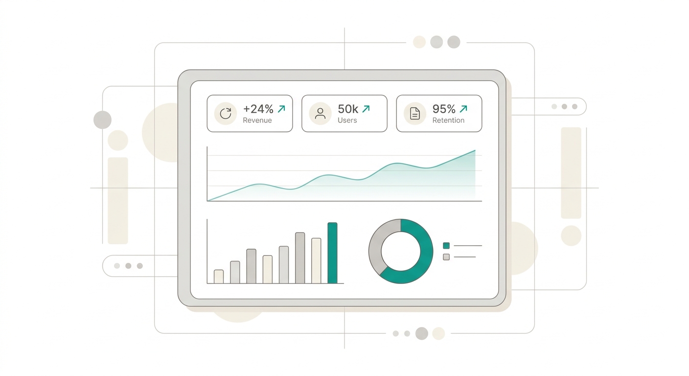
Every Monday at 9 a.m., thousands of managers open Excel, consolidate data from four different sources, format cells, and send an email with 'the weekly report.' By the time the team reads it, the data is three days stale and decisions are being made on an outdated snapshot of the business.
A well-built dashboard eliminates that cycle. You connect your data sources once and get a live view of the business every time you open it. What used to take four hours of manual work is now available in seconds.
In this guide you'll learn to identify what type of dashboard each level of your organization needs, how to design it so your team actually uses it (not just stares at it), what mistakes destroy trust in a panel, and how AI is changing the rules: you no longer need a data team to have professional dashboards.
What a dashboard actually does
A well-built dashboard answers three fundamental questions in seconds: are we on track? What’s breaking? Where should we look first?
- Centralize sales, operations, and finance KPIs on a single screen — Stop opening five Excel files, two systems, and three emails to understand how the business is doing.
- Cut hours spent consolidating manual reports — What used to take half a day of manual work now updates automatically.
- Give managers and teams visibility without depending on analysts — A dashboard empowers decision-makers without middlemen. Information arrives directly.
- Spot deviations early with up-to-date metrics — A red KPI shows up instantly. You don’t wait until month-end to discover something went wrong.
- Align the team with the same numbers — The classic “I have different data” disappears when everyone consults the same source of truth.
- Tell a story with data, not just display numbers — A good dashboard has narrative: it guides the viewer’s eye from general to specific.
Types of dashboards
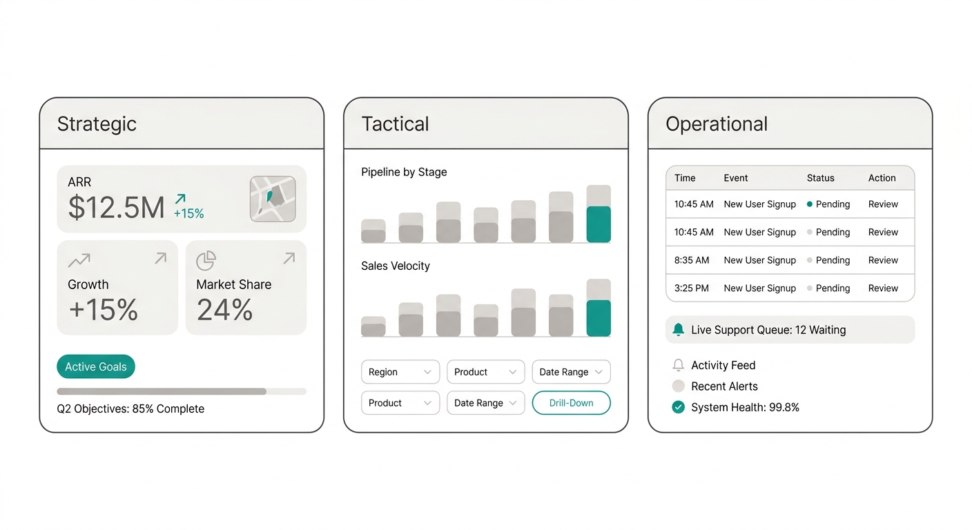
There’s no single type of dashboard. Each organizational level needs a different view. Mixing them into one panel confuses everyone.
Strategic dashboard
Audience: C-suite, CEOs, founders. Review frequency: Monthly / quarterly. Purpose: Answer “are we heading in the right direction?”
- High-level metrics: revenue, margin, churn, NPS, market share.
- Prioritizes context and trend over detail. Direction matters more than the exact number.
- Clean visualization: a few large KPIs, trend charts, comparisons against targets.
- Usually requires no interaction or filters: it’s an executive snapshot.
Tactical dashboard
Audience: Area managers, department heads. Review frequency: Weekly. Purpose: Answer “what’s working and what’s not?”
- Management metrics: pipeline by stage, quota attainment by team, productivity.
- Allows drill-down with filters: by rep, by region, by product, by month.
- Combines leading and lagging KPIs for management context.
- Managers use it to make decisions: reallocate resources, adjust targets, spot opportunities.
Operational dashboard
Audience: Supervisors, teams, analysts. Review frequency: Daily / real-time. Purpose: Answer “what’s happening right now?”
- Detailed, volatile metrics: daily leads, orders in production, open tickets, system uptime.
- Constant refresh (minute-by-minute or live).
- Visible alerts and thresholds for immediate reaction.
- Information-dense design because the user knows it in detail.
Which one do you need?
Most companies start with a tactical dashboard (weekly team management) and then evolve toward the other two. If you’re just getting started, build the tactical one first: it gives you the highest return on effort.
Key components of a dashboard
A dashboard isn’t just a collage of charts. It has structural elements that make it useful.
1. Primary KPIs — The 3–5 big numbers that answer the panel’s main question. They go at the top, visible without scrolling. Each one with variance vs. prior period and a status indicator.
2. Trend charts — Show evolution over time. Lines for continuous trends, bars for comparing periods. Without trend, a KPI is just a photo without context.
3. Detail tables — When you need the breakdown: sales by rep, tickets by agent, orders by customer. Tables should be filterable and exportable.
4. Filters and interactivity — Users must be able to segment: by date, by region, by team, by product. A dashboard without filters is a poster, not a management tool.
5. Alerts and thresholds — Visual indicators (green/yellow/red) that silently signal what needs attention. The human eye detects color before numbers.
6. Context and narrative — Descriptive titles, annotations, comparisons against targets, percentage variance. Context turns data into information.
7. Update timestamp — Users need to know how fresh the data is: “updated 5 minutes ago,” “data as of yesterday’s close,” “last updated: June 15, 2025.”
Dashboard design principles
Dashboard design isn’t aesthetics: it’s functionality. Bad design hides information, confuses decisions, and ultimately makes the team ignore the panel.
Visual hierarchy
The most important thing must be the most visible. Primary KPIs go at the top left (where the eye looks first). Details and breakdowns sit below.
Practical rule: If the user has to scroll to see the most important KPI, the design is wrong.
Data-ink ratio
Coined by Edward Tufte: maximize the proportion of ink (or pixels) dedicated to data versus decorative ink.
- Reduce visual noise: eliminate flashy backgrounds, excessive shadows, thick borders, unnecessary 3D effects.
- Charts should show data, not decoration. A 3D pie chart with 12 categories is noise. A simple bar with 4 categories is information.
- Every element must earn its place. If a border, a color, or a label doesn’t carry information, drop it.
Color with purpose
- Use colors with semantic meaning: green = good, red = bad, yellow = warning.
- No more than 3–4 non-semantic colors (to differentiate series in a chart).
- Consider color blindness: don’t rely on red and green as the only differentiator. Add texture or icons.
Consistency
- Same time scale across all charts in the same panel.
- Same color convention throughout the dashboard.
- Same location for filters and controls.
- Same number formatting (decimals, thousands separators, currency symbols).
Mobile-first (or at least responsive)
More and more managers check dashboards from their phones between meetings. A dashboard that only works on a 27” screen falls short.
Live dashboard vs static report
One of the most important concepts many companies discover too late.
Live dashboard
Updates automatically when source data changes. Advantages:
- You always see the most recent snapshot of the business.
- There are no “versions” of the report.
- The team trusts that what they see is real.
Static report (PDF, Excel)
Generated at a specific moment and doesn’t change. Advantages:
- Useful for formal meetings, committees, investor presentations.
- Serves as a “frozen” historical record of a period.
- Works when stakeholders don’t have access to the system.
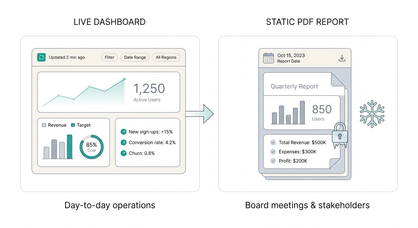
Most teams make the mistake of using only one of the two. Those who only use live dashboards show up to the board meeting with a laptop, share their screen, and lose 10 minutes navigating while directors grow impatient. Those who only use PDFs show up to the weekly meeting with data from four days ago and make decisions about a business that has already changed.
The ideal combo: live dashboard for day-to-day + scheduled automatic PDF reports for stakeholders who need a frozen view.
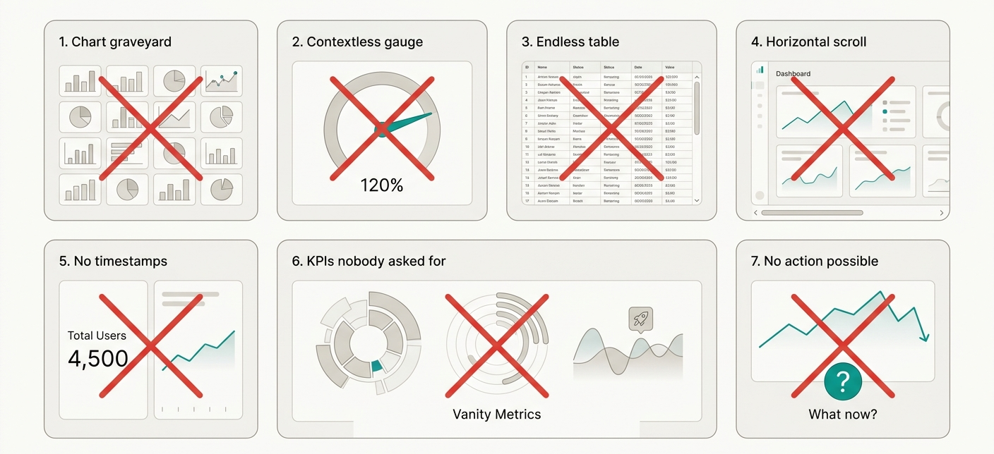
Dashboard anti-patterns
With experience you see the same mistakes over and over. These are the most common:
1. The chart graveyard — The dashboard has 15 charts, all the same size, no hierarchy, no clear title. The user doesn’t know where to start and ends up ignoring all of them.
2. The speedometer without context — That gauge chart showing a number with no variance, no target, no history. “We’re at 65” means nothing if you don’t know whether the target was 60 or 100.
3. The endless table — A table with 50 columns and 200 rows promising “all the detail.” A table is not a dashboard: it’s a database dump. If you need that much detail, use an interactive filter or an Excel export.
4. Horizontal scroll hell — The dashboard doesn’t fit on a single screen and forces horizontal scrolling. Yes, it happens in meetings and it’s awkward for everyone.
5. Timeless data — The dashboard shows numbers but doesn’t indicate what period they belong to. “Sales: $50,000” — from yesterday? Last week? Last month? Without time context, the data loses value.
6. The KPI nobody asked for — Charts included “just in case” or because “they look nice.” Every metric must answer a business question. No question, no chart.
7. No possible action — The dashboard shows something is wrong but offers no clues about what to do. A good dashboard doesn’t just inform: it guides the decision.
From manual Excel to automatic dashboard
Many teams start by consolidating data by hand. A properly configured dashboard eliminates that repetitive step.
The typical transition has three phases:
Phase 1 — The Excel kingdom
The team tracks numbers in spreadsheets. Everyone has their own version. Reports are pieced together manually on the last Friday of the month and arrive late. Meetings start with “I have different numbers.”
Phase 2 — The initial dashboard
You connect your main sources (Sheets, CRM, database) to a dashboard tool. You define the key KPIs, create the visualizations, and share the link with the team. Meetings now start with “let’s look at the dashboard.”
Phase 3 — AI automation
The dashboard no longer just displays data: it helps you interpret it. AI describes what’s happening in natural language. PDF reports are scheduled and sent automatically. The assistant answers questions conversationally: “Why did sales drop this month?”
01 — Connect your sources — Sheets, databases, or CRM. Your data flows on its own into the panel.
02 — Define what metrics matter — Choose the KPIs your team actually uses to decide, not dozens of decorative charts.
03 — Share and automate — The team checks the dashboard when they need it; reports send themselves if you set them up.
How to present a dashboard to stakeholders
Having a dashboard is step one. Getting the team to use it and make decisions based on it is the real goal.
Structure of a dashboard review session
1. Start with the primary KPIs (2 minutes) — Show the big numbers. Quickly point out the green ones and stop at the red ones. Don’t read every number: highlight what changed.
2. Drill into trends (3 minutes) — For KPIs in red or yellow, show the trend. Is this a new problem or has it been brewing? Is there seasonality?
3. Filter to find the cause (3 minutes) — Use filters to segment: is the problem general or does it affect a specific region, product, or team? This is where a dashboard proves its value over a static report.
4. Define actions (2 minutes) — For every significant deviation, agree on an action with an owner and a deadline. A dashboard without action is just a pretty report.
5. Close with the weekly plan (2 minutes) — Summary: what we’ll keep doing, what we’ll change, and who leads each initiative.
Golden rule
The dashboard should be the starting point of the discussion, not the end point. If the meeting gets consumed debating whether the data is right, something is off with your source of truth.
Dashboard governance: keep them alive
An abandoned dashboard is worse than having none: it destroys the team’s trust in data. Like any business asset, it needs an owner, maintenance, and an expiration date.
Clear owner. Every panel must have a single person responsible — not a team, a person. Their job isn’t updating data (that’s automatic), but making sure the KPIs remain relevant and thresholds stay calibrated. If the business pivots, the owner adjusts the dashboard.
Scheduled expiration. Every dashboard should have a quarterly review date. At that review there are three options: keep it as-is, adjust it (change KPIs, thresholds, sources), or retire it. If nobody opened it in 60 days, retire it without drama. A zombie dashboard contaminates the data culture.
One view with filters, not 30 dashboards. The classic mistake of growing companies: marketing has its dashboard, sales has theirs, finance has another, and all show different versions of the same number. Prefer a flexible panel with filters by area, period, and owner. A single dashboard that adapts to whoever is looking at it.
Minimum standard. Before publishing a new dashboard, answer three questions: what decision does it enable? How often does it update? Who owns it? If you can’t answer in 30 seconds, the dashboard isn’t ready.
Golden rule: if a KPI stays red three weeks in a row and nobody did anything, the problem isn’t the KPI — it’s that the dashboard isn’t connected to a decision process.
AI automation
The natural evolution of dashboards is moving from a panel you look at to an assistant that informs you.
Automatic narrative — AI generates a natural-language summary of what’s happening: “Sales grew 12% this month driven by the northern region, but margin dropped 3 points due to rising logistics costs.”
Smart alerts — Not just a red light. AI notifies you via Slack, email, or SMS when a KPI deviates, and suggests a probable cause: “Churn rose to 5.2%. The customers who canceled this month have in common that they never used the automated reports feature.”
AI-generated dashboards — You describe your business in natural language and AI builds your dashboard: selects relevant KPIs, chooses the right chart type for each one, organizes the layout, and connects data sources. What used to take weeks now takes minutes.
Q&A — Instead of navigating charts, you ask: “How are sales this quarter compared to last quarter?” and the assistant responds by showing the relevant chart. It’s the natural evolution of dashboards: from visual interface to conversational interface.
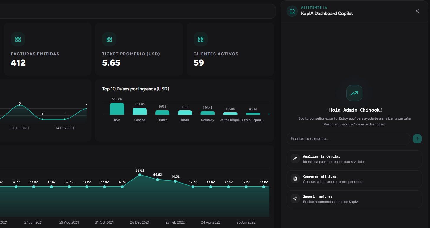
In RapidBoard, KapIA does exactly that: you describe your business, connect your sources, and in seconds you have a dashboard with KPIs, charts, and automatic narrative. No code, no analysts, no waiting.
Get started today with
RapidBoard for your team
Early access is open. Join the first 100 spots and start making data-driven decisions faster.