What is a KPI?
90% of teams that say they 'measure performance' are staring at dashboards full of metrics that don't help them decide anything. A real KPI isn't a pretty number on a screen: it's a signal that forces you to act.
In this guide you won't just understand what a KPI is. You'll learn to build your own measurement system: from choosing the three indicators that actually move your business to setting up the 15-minute weekly routine that replaces dozens of unproductive meetings.
If by the end of this you don't know exactly which KPI you'll check next Monday at 9 a.m., this guide failed its purpose.
Characteristics of a good KPI
Not every number you see in a report qualifies as a KPI. For an indicator to earn that name it must meet several conditions:
- It’s tied to a clear business objective — If you don’t know what goal it serves, it’s not a KPI, it’s a number floating without context.
- It’s measurable with data you already have or can obtain — The most elegant KPI in the world is useless if you can’t calculate it with your current data sources.
- It enables a concrete action if it worsens — This is the acid test: if the indicator drops and you don’t know what to do, you’re missing an associated action plan.
- It’s reviewed regularly (weekly or monthly, depending on the area) — A KPI you look at once a year isn’t a management indicator, it’s historical trivia.
- It’s understandable to the decision-maker, not just analysts — If you need a master’s in statistics to interpret it, the indicator fails at its purpose.
KPI vs Metric vs OKR: the pyramid that orders your business
The most frequent mistake when measuring a business is treating metrics, KPIs, and OKRs as synonyms. They are three distinct levels of the same pyramid. Understanding the difference is what separates a team drowning in data from one that makes decisions.
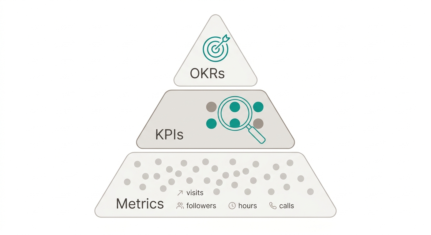
A Metric is any data point your business produces. Blog visits, social media followers, hours worked, calls made. They’re background noise: they’re there, you see them, but they don’t tell you whether you’re winning or losing.
A KPI (Key Performance Indicator) is a metric you chose because it alerts you whether the business is advancing or stalling. The difference isn’t in the number but in the decision: if that KPI moves, do you know what action to take? If the answer is no, it’s still a metric, not a KPI.
An OKR (Objectives and Key Results) is the quarterly management framework that gives direction to your KPIs. It defines an ambitious objective and 3-5 measurable key results. Real example: “Reduce implementation time from 14 to 5 days” (objective), measured by “days from signed contract to customer’s first access” (KPI).
In practice: any given Tuesday you look at metrics for context, review KPIs to decide if something needs correcting, and at the start of the quarter you define OKRs to align the team on where the business is heading. Three levels, three rhythms, one direction.
Leading vs Lagging KPIs
Another fundamental classification that transforms how you interpret your indicators.
Lagging KPIs
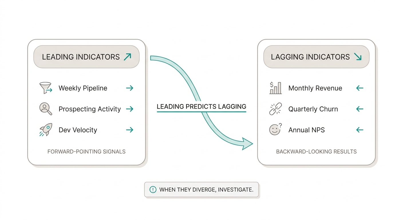
They measure past results. They tell you what happened, but you can’t change it. Excellent for evaluating historical performance.
Examples:
- Closed-quarter revenue
- Previous month’s churn rate
- Last survey’s NPS
- Period gross margin
Utility: confirming whether the strategy worked. Limitation: by the time you see them, it’s too late to react.
Leading KPIs
They measure early signals that predict future outcomes. They’re the most valuable for daily management because they let you course-correct before the result solidifies.
Examples:
- Leads generated this week (predicts future revenue)
- Prospecting activity per sales rep (predicts pipeline)
- Dev team velocity (predicts delivery date)
- Qualified website traffic (predicts conversions)
Utility: acting before the outcome materializes.
How to combine them
A well-built dashboard mixes both types. You use leading indicators to manage day-to-day and lagging indicators to validate you’re heading in the right direction. The key is understanding that these indicators dance together: when they diverge, there’s a story to investigate.
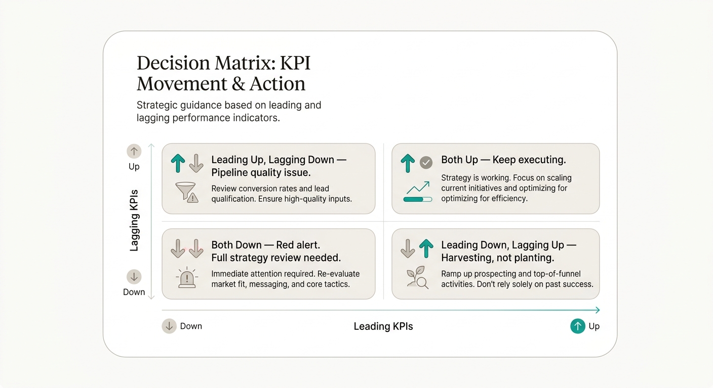
In practice this looks more like a traffic light than a spreadsheet. If your weekly pipeline (leading) is growing but your monthly revenue (lagging) is dropping, something doesn’t add up: either your pipeline isn’t quality, or your team isn’t closing, or you’re measuring the wrong signal. The matrix forces you to ask the right question before reacting.
The SMART framework applied to KPIs
The SMART method isn’t just for personal goals. Applied to KPIs, it ensures every indicator is well-defined from day one.
- S — Specific: the KPI must be precise. “Improve sales” is not a KPI. “Increase lead-to-customer conversion rate” is.
- M — Measurable: you need concrete data. “Satisfied customer” isn’t measurable. “NPS above 70” is.
- A — Achievable: the target must be realistic. Going from 10 to 10,000 customers in one month isn’t achievable. From 10 to 15 is.
- R — Relevant: the KPI must matter for your strategic objective. Measuring office coffee consumption isn’t relevant to revenue growth.
- T — Time-bound: every target needs a deadline. “Reduce churn” without a date creates no urgency. “Reduce churn from 5% to 3% in the next 60 days” is a SMART KPI.
Full example
Objective: Improve customer retention in the SMB segment.
SMART KPI: Monthly cancellation rate for SMB customers.
- S: focused on the SMB segment, not the entire base.
- M: calculated as lost customers divided by active customers at the start of the month.
- A: moving from 6% to 3% over 6 months, something other teams have achieved.
- R: retention is the number-one priority this quarter.
- T: target by Q3 close.
KPI examples by department
Quick reference of common indicators by department. Use it as a starting point, not a definitive list.
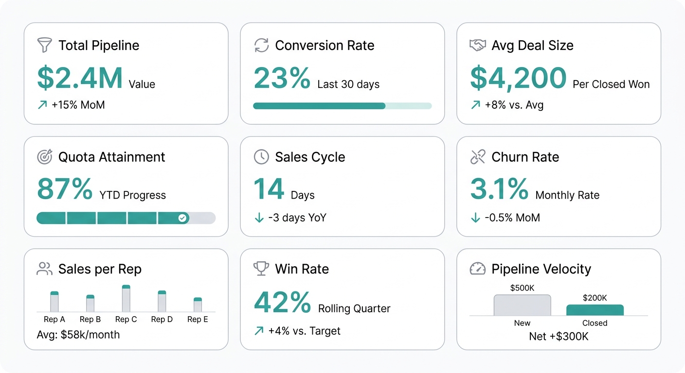
Sales — Conversion rate, average deal size, active pipeline, quota attainment, sales cycle, win rate, pipeline velocity.
Operations — Delivery time, error rate, capacity utilization, cost per unit, OTIF (On Time In Full), inventory turnover.
Finance — Gross margin, cash flow, Days Sales Outstanding (DSO), EBITDA, liquidity ratio, ROI, net margin.
Marketing — Cost per lead (CPL), ROAS, email open rate, landing page conversion, CAC (customer acquisition cost), MQL to SQL.
HR — Employee turnover, time to hire, eNPS, training hours per employee, absenteeism.
Product — DAU/MAU, retention (D1, D7, D30), feature adoption, NPS by feature, time to “aha moment.”
Key commercial KPIs
If you lead sales or commercial, these are usually the first indicators worth tracking on a dashboard.
Total pipeline — Value of open opportunities. Anticipates future revenue and detects prospecting gaps.
Conversion rate — Percentage of leads or opportunities that close. Measures sales team efficiency.
Average deal size — Average amount per sale. Useful to see if you’re increasing value per customer or relying on volume.
Quota attainment — Progress vs. period target. The KPI every sales manager checks first.
Sales cycle — Days from contact to close. Identifies friction in the sales process.
Churn / cancellation rate — Customers who leave. Complements new sales with actual retention.
Sales per rep — Individual productivity and workload distribution across the team.
Win rate — Percentage of proposals won. Signals opportunity quality and value proposition strength.
Pipeline velocity — How much new pipeline you generate per week vs. how much you close. Reveals whether the team is planting or just harvesting.
KPIs by industry
Every industry has its own key indicators. Here’s a quick reference:
SaaS / Technology
- MRR (Monthly Recurring Revenue) and ARR
- Churn rate (monthly and annual)
- LTV (Lifetime Value) and LTV/CAC ratio
- Net Revenue Retention (NRR)
- Time to Go Live
Retail / E-commerce
- Sales per square foot (physical stores)
- Average Order Value (AOV)
- Cart abandonment rate
- Inventory turnover
- Sell-through rate
Manufacturing
- OEE (Overall Equipment Effectiveness)
- Defect rate / ppm (parts per million)
- Production cycle time
- Downtime
- First Pass Yield
Services / Consulting
- Utilization rate (% billable hours)
- Margin per project
- Customer satisfaction (CSAT)
- Billable / non-billable ratio
KPI Tree
A KPI Tree breaks down a strategic objective into more specific indicators. This is how you go from a board-level target to operational metrics that each team can manage.
Example: “Increase revenue by 20%”
Total revenue (+20%)
├── New customer revenue (+30%)
│   ├── Leads generated (leading)
│   ├── Lead-to-customer conversion rate
│   └── Average deal size — new customers
├── Existing customer revenue (+15%)
│   ├── Retention rate
│   ├── Expansion / upsell per customer
│   └── NPS (retention predictor)
└── Sales efficiency (-10% cost of sale)
    ├── CAC (customer acquisition cost)
    ├── Sales cycle (days)
    └── Productivity per rep
Each level of the tree corresponds to a different owner:
- Level 1 (strategic): reviewed by leadership.
- Level 2 (tactical): managed by department heads.
- Level 3 (operational): executed by teams day to day.
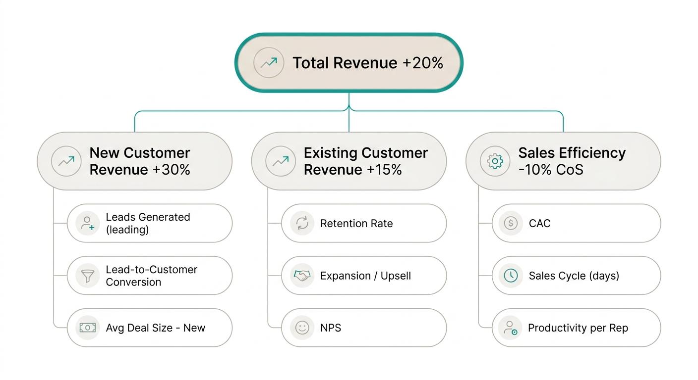
Building your KPI tree is the most important step before creating a dashboard. Without it, you end up with a board full of pretty charts but no hierarchy or purpose.
Common mistakes when defining KPIs
Even experienced teams fall into these traps. Recognizing them is the first step to avoiding them.
1. Measure everything that moves — More KPIs is not better. A dashboard with 30 indicators paralyzes instead of accelerating decisions. Priority: 3-5 KPIs per objective.
2. Using vanity metrics — Likes, visits, downloads, impressions. Numbers that look good in a meeting but don’t correlate with business results. If you can’t tie it to revenue, satisfaction, or efficiency, it’s decorative.
3. No target or threshold — A KPI without a target is just a number. “Conversion rate was 3.2%” tells you nothing. “Should be between 3% and 5%, we’re at 3.2%, yellow status” gives you context to decide.
4. KPIs without owners — If everyone is responsible for the KPI, nobody is. Every indicator must have a person or team that owns it.
5. Never reviewing or updating KPIs — You define KPIs in January and leave them frozen all year. The business changes, KPIs should change too. A quarterly review prevents obsolete indicators.
6. Confusing activity with outcome — “Calls made” is activity. “Call-to-meeting conversion rate” is outcome. The KPI must measure impact, not effort.
7. Ignoring context — “Sales dropped 10%” sounds bad. But if the total market fell 20%, you’re gaining share. A KPI without context is dangerous.
How to set targets and thresholds
A target without a traffic-light system is incomplete. Defining thresholds lets you know at a glance whether you’re doing well, okay, or badly.
- Green (healthy): the KPI is in range. Keep executing.
- Yellow (warning): the KPI has deviated but is recoverable. Needs attention.
- Red (critical): the KPI is out of range. Immediate corrective action required.
Example for conversion rate:
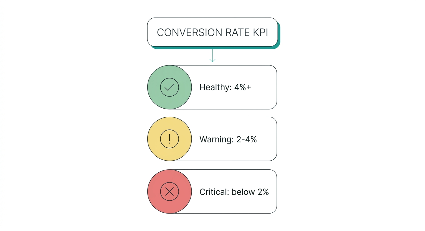
Thresholds aren’t arbitrary: they can be based on industry benchmarks, the team’s own historical data, or business targets. What matters is defining them BEFORE you start measuring. If you define them after seeing the data, you’re justifying, not measuring.
A good practice: define thresholds in a quarterly meeting with the team that executes. When the team participates in deciding what’s green and red, they own the KPI. It stops being “the number the boss asks for” and becomes “our indicator.”
KPI review cadence
Not all KPIs are reviewed with the same frequency. The most common mistake is reviewing operational KPIs once a month (when the damage is already done) or demanding strategic KPIs every Monday (when they haven’t had time to move).
Daily KPIs (operational) — Reviewed day to day. Examples: daily leads, shift production, system uptime, open support tickets.
Weekly KPIs (tactical) — Discussed in team meetings. Examples: pipeline generated, weekly conversion rate, project milestone completion, billable hours.
Monthly KPIs (managerial) — Presented in department reports. Examples: MRR, churn rate, gross margin, employee turnover.
Quarterly KPIs (strategic) — Reviewed in OKR and planning sessions. Examples: ARR, NPS, market share, LTV/CAC.
The 15-minute routine that changes everything
A Latin American fintech’s sales team implemented this weekly routine and doubled their close rate in 6 months:
- Monday 9:00 — 3 minutes: dashboard on screen. Only red and yellow KPIs are looked at. Nobody celebrates the green ones.
- Monday 9:03 — 7 minutes: for each red KPI, the owner explains in 60 seconds: what happened, why, and what they’ll do this week to fix it.
- Monday 9:10 — 5 minutes: ONE action is assigned per critical KPI, with a name and a deadline (this Friday, not “whenever possible”).
The weekly KPI meeting isn’t for looking at numbers: it’s for making decisions. If it ends without assigned actions, it was a waste-of-time meeting.
How to choose your KPIs: the definitive checklist
If you take only one thing from this guide, make it this. Before putting a KPI on a dashboard, run it through these 5 questions. If it fails a single one, start over.
1. Does it serve a quarterly goal? — If you don’t know what strategic objective it’s tied to, it’s decoration, not a KPI. Rule: 3-5 KPIs per objective, no more.
2. Do you have the data to calculate it? — The most elegant KPI is useless if you need three weeks of data engineering to obtain it. Start with what you already have: a well-maintained Google Sheet is better than a data warehouse that never arrives.
3. Do you know what to do if it worsens? — This is the acid test. If the KPI drops and your answer is “we’d have to investigate,” you need to sharpen the action plan BEFORE measuring.
4. Does it have an owner, a target, and a deadline? — Without an owner, nobody acts. Without a target, you don’t know if you’re winning. Without a deadline, it’s always “next quarter.”
5. Does your team understand it in 10 seconds? — If you have to explain what it means every Monday, the KPI is too complex. “Conversion rate” is understandable. “Seasonally-adjusted operational efficiency coefficient” is not.
Build your KPI tree before designing the dashboard. Combine leading and lagging. Define traffic-light thresholds before the first measurement. And most importantly: if a KPI doesn’t generate a decision in a month, retire it. KPIs expire.
Get started today with
RapidBoard for your team
Early access is open. Join the first 100 spots and start making data-driven decisions faster.